Wednesday, June 17, 2009

Wax Packs: WALLPAPER!

Desktop wallpaper using the designs of non-sports card wrappers.
This week: Star Wars, Series 2.


1600x1200


1440x900


1280x1024


1024X786

Han Solo, P.I.

Wax Packs: Batman (series 1)

Wow.
I used to own a different versions of this set when it was originally released. Topps released two series, as well as two “factory sealed” editions that included bonus cards. This review is for the standard “wax pack” set.

Batman was probably the most popular set of non-sports cards since Star Wars. It was also the swansong for the traditional pulp-style trading cards. Competition from companies like Score were putting pressure on Topps to change its production styles. Upper Deck printed its first series of baseball cards in 1989 - the same year as Batman - and it was apparent that the days of pulp card stock were almost over. Gremlins 2 and Robocop 2 continued the tradition, but they were the last of a dying breed.
Unfortunately, when the market began to follow the collectors (as opposed to the other way around) it was bad news for all involved. Cards (and comics) stopped being a cheap diversion for kids and collectors and started to become an expensive habit that many delusional people thought would make them rich.

Anyway, time has been good to the first series of Batman cards. I hadn't looked at these in years but was really impressed after finding an affordable set online. I've added about 20 full sets to my collection in recent months, and this is easily the best of them.

REVIEW:

Cover Card: (4 out of 5)
The art is a bit of old-school “cut and paste” that uses one of the famous promo shots of Batman and the Batmobile, as well as the movie’s logo. I think the iconic logo would have been a better selection, but the logo is used to better effect on the front of each card.

Design: (9 out of 10)
Amazingly simple, but crisp and clean. The typography is sharp and consistent, and the use of the “bat symbol” from the poster is a pretty neat addition to the art. The marketing of the film tended to rely on this image, which was an instantly recognizable icon.

Photography: (10 out of 10)
At 132 cards, this is a big series. Still, there are only a few cards that come off as unnecessary and repetitive. Overall the photos are great choices that show off the movie’s cinematography, costumes and production designs (which were its strongest points.)

Production: (10 out of 10)
The photos are all bright and clear. Even the spot color reverse sides are clean and easy to read. When it comes to pulp stock, this is as good as it gets.

The Other Side: (4 out of 5)
There are no puzzles in this series, but the text on the back (which offers summaries and trivia) is incredibly thorough. While most cards settle for a sentence or two, many of these cards have several paragraphs of text on them. A very tight design.

Stickers: (9 out of 10)
Simple, but hews close to Topps’ traditional sticker design. You can draw a straight line from the stickers for the company’s 1976 Star Trek sticker series to this set. Still, a lot of images are repeated from the card set, which is a common problem for any series this big.

TOTAL: 92 PERCENT (46 out of 50)

Friday, June 12, 2009

Wax Packs: Battlestar Galactica

I'm one of those rare beasts who like the original and "re-imagined" Battlestar Galactica. While I'll concede that the new series is better on pretty much every level, there's still a lot to love about the original, which is more Flash Gordon/Star Wars than The Shield.
I had a lot of these cards as a child. Even had some of the Wonder Bread cards, which were printed in better card stock but lacked the crisp design of the Topps series.
And what a series it is! Somehow, BSG skirted the rules of non-sport trading cards by producing a massive 132-card set, with a 22-sticker subset. That's twice as large as any single-series of Star Wars cards.
BSG burned out quickly, though, and was gone by the end of it's first year. Naturally, it took the Topps series with it, and it would be many more years before BSG returned to trading cards.
This series also includes a few cards of my first boyhood crush, Maren Jenson. By all rights, that honor should have fallen on Batgirl, but Maren just happened to be in the right place at the right time, I guess.

REVIEW:

Cover Card: (0 out of 5)
Nope. The idea of the "cover card" hadn't really caught on yet at Topps. To add insult to injury, the first card in the set features Lorne Green striking a sexy pose.

Design: (8 out of 10)
Crips and bright, though a little generic. While the "cutline" is a little dull, I love how the logo is prominently displayed on the front of each card. (Weirdly, BSG had two different logos, one that appeared on merchandise like cards and comics, and the one that was used in the title credits.) And the design allows for both verticle and horizontal positioning without disruption.

Photography: (9 out of 10)
Just short of perfect. This is a case where a card set's reach exceeds its grasp. The cards were produced using (primarily) images from the pilot episode. By trying to squeeze 132 cards from a single film, some of the images get a little repetitive. On the plus side, though, there are a few promo photos used, apparently taken on the Universal Studios lot. Outside of Star Wars, it's hard to find "behind the scenes" cards. Remember what I said about Miss Jansen?

Production: (9 out of 10)
Pretty good. Not as sharp and clear as some of the Star Wars cards, but leaps and bounds beter than the photos in the second Return of the Jedi series. There are a handful of dark, grainy photos in this set, something that could have been corrected by reducing the series to 100 cards.

The Other Side: (4 out of 5)
A puzzle, trivia and details about the cast and crew. Good stuff, but nothing groundbreaking.

Stickers: (8 out of 10)
With a set this ambitious, ,there's bound to be some re-runs. Many (all?) of these stickers reproduce photos already found on the cards. That's not such a bad thing, though. Also, the stickers are based on the designs of the Star Trek/Star Wars stickers, so there's a great sense of lineage in this set.

TOTAL: 76 PERCENT (38 out of 50)

Thursday, June 11, 2009

Fred and Barney Meet the Thing


Here, for no reason, is some fairly bad video from Fred and Barney Meet the Thing, and honest-to-god Saturday morning cartoon in the 1970s. This is one of the most bizarre productions from a decade that specialized in bizarre productions (Lidsville, anyone?)

Wax Packs: WALLPAPER!

Desktop wallpaper using the designs of non-sports card wrappers.
First up: E.T. the Extra-Terrestrial


1600x1200


1440x900


1280x1024


1024X786


Wax Packs: Close Encounters of the Third Kind

So, I've been re-discovering my love of "non-sport" trading cards in recent weeks.
As it turns out, these cards aren't worth much these days, with only a few exceptions. Many of these cards I had as a child, but haven't seen them in 20-25 years. My memories of them are still vivid — such as walking down to the local Junior Market to buy Star Wars or Jaws 2 wax packs — and it's surprising how well I still remember the small details about these cards.
What's also surprising are some of the things I didn't notice. Which brings me to my first short review for the 1978 set of Close Encounters of the Third Kind trading cards.
This is one of the few non-sport series I can think of that relies on such as dark design. Later in the year Topps would also adopt black borders into the design of the Jaws 2 series, and it works pretty well for both movies. It also makes them stand out from the blue/red color schemes that were so prevelant because, I presume, of the success of the Star Wars cards.
As a kid, I was a little weirded out by the "Starring Melinda Dillon" card in the CEOT3K series. The lighting was strange, and it was so tightly cropped that it was hard to tell exactly what was happening in it. It looked overtly sexual for some reason (I don't know why.) I came across this card, as well as the Teri Garr "actress" card when something occurred to me ... where was the Richard Dreyfuss card? I flipped quickly to the set only to find that the star of the movie appears nowhere in the entire set. There were probably legal reasons for this, but it's still damn bizarre.
REVIEW:

Cover Card: (0 out of 5)
Nope. The series kicks off with a #1 card depicting a parked fight plane from the 1940s. Yawn.

Design: (8 out of 10)
There's a lot to be said for simplicity. The front design never intereferes with the photography. In fact, the dark borders actually make the color in the cards that much more vivid.

Photography: (8 out of 10)
Overall, pretty good. The series is hampered by the absence of Richard Dreyfuss, so the movie's lead character — and participant in the film's most important scenes — come off as a little awkward. Still, the solution is kind of fun ... LOTS of photos of the "mother ship" landing from the end of the movie make for some colorful, if slightly repetitive, cards. Oh, and Steven Speilberg ever gets a card!

Production: (8 out of 10)
The photos are pretty sharp, but nothing to get excited about. Considering how inconsistent Topps' photo quality was in its nonsports cards (which might have been the fault of the movie studios and not Topps,) CEOT3K is a solid, if unspectaular, set.

The Other Side: (4 out of 5)
Story synopsis, trivia and a puzzle. Pretty much what you'd expect from Topps in the late 1970s.

Stickers: (7 out of 10)
The stickers reprint many of the "mother ship" landing cards on slick paper. While they look nice and hold up well as an independent set, the problem of repitition in the cards is even more pronounced. Still, there are some nice SFX photos here, even if the alien card looks a little scary.

TOTAL: 70 PERCENT (35 out of 50)

Friday, March 20, 2009

Inteview with Herb Trimpe


It looks like there's a Herb Trimpe renaissance taking place. He's had new work published in Hulk specials over at Marvel, while fandom is taking a second look at his legacy (which follows about 15 years of Wizard magazine talking shit about him. Who's laughing now Gareb Shamus?) I met Trimpe last year at a convention and he had one of the longest lines in the building (and accidentally managed to block people from visiting June Brigman's table next to his.)

The interview above is from a 2008 Pop Culture America show.

Thursday, March 19, 2009

The Master of Quack Fu

I love me some Howard the Duck, but the book always worked best when it avoided explicit superhero parodies.
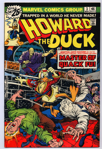
The weakest issues in the series were parodies of other Marvel titles. Sure, “Iron Duck” and the “Master of Quak Fu” made for some great cover art, but the stories were tepid (Howard as “Son of Satan” is the exception.)
The third issue is intended as a lampoon of the kung fu craze of the mid 1970s. The problem is that writer Steve Gerber doesn’t really know what he thinks about the fad. Howard, of course, hates it, but Gerber can’t eloquently explain why, and the book frequently contradicts itself.
The story begins with Howard and Beverly leaving a kung fu movie. Howard is clearly disgusted by the violence in the film, calling it “training for the local troops.” He also takes issue with Hollywood exploiting as “ancient tradition” for its own end as he stands on the street shouting at people. All he needs is a box to stand on with the word “soap” written on it.
Anyway, the kung fu craze gets out of control when, at a local diner, Howard and Bev see a character named "Count Macho" (based on Count Dante, who ran numerous ads in comics in the 1970s) kill an overzealous karate fan.
Early in the issue, Howard proclaims that people who enjoy violence "don't have the mental equipment to be sure they exists." So what does he do when Count Macho kidnaps Bev? He takes a crash course in kung fu so that he can fight back. Like all good liberals (and conservatives, for that) Howard's real concern isn't his own ability to process reality ... it's everyone else's. He thinks he lives in a world of idiots, which is probably true. He simply can't recognize that he's an idiot, too.
I'm not really sure what Gerber's message here, was. It begins as a slam against kung fu movies, but the story would have felt at home in a Shaw Brothers picture. Howard abhors violence, but turns to it the first chance he gets. Because the story has no intellectual center to argue from, the issue feels like nothing more than propaghanda.
The issue features guest art by John Buscema. Frank Brunner quit after two issues when Marvel passed on a requested pay raise. It was their loss ... Brunner is a fantastic artist.

Friday, March 13, 2009

Vertigo gets off to an early start

DC Comic's "Vertigo" imprint didn't launch until 1993, but the seeds for the line had been in place since the early 1970s. DC had experimented with more mature titles (i.e., "not superheroes") a few times, with such books as Swamp Thing, The Shadow, Jonah Hex and their assorted mystery/horror anthologies. For a lot of reasons (such the the national paper shortage, changes in editorial staff, etc.) the company had a hard time keeping any new book in print for more than a dozen issues, so many of their best books were also their most brief.
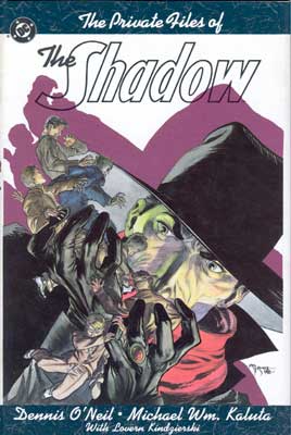
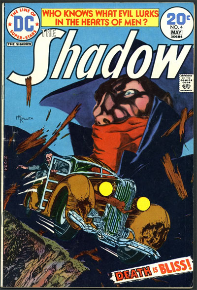
One of the best comics the company published in the 1070s was the Denny O'Neil/Mike Kaluta interpretation of The Shadow (it also featured some occasionally uncredited assistance from Jeff Jones and Bernie Wrightson.) It was a no-nonsense interpretation of the William Gibson pulps, with The Shadow portrayed more like an underworld boogeyman than a costumed adventurer. Kaluta left the book after a few issues, with the remainder completed by the likes of Frank Robbins and the much-underrated E.R. Cruz. The series even featured the first meeting of The Shadow and The Avenger, something that pulp fanboys had been talking about for decades. They'd meet again in the late 1980s, during the controversial — and hilarious — run on The Shadow by Andy Helfler and Kyle Baker (anther prototype series for Vertigo.)
After a dozen issues, though, DC pulled the plug. O'Neil said he was never offered a reason for the book's cancellation and had every reason to believe it had sold well (at least, well enough to continue publication.) The O'Neil/Kaluta stories were collected in The Private Files of The Shadow, a hardback that has been out of print for many years (and will likey remain so, seeing how the comic rights to The Shadow are about as popular as Chris Brown right now.)

Thursday, March 12, 2009

Tomb of Dracula: THE MOVIE


No, I don't mean Blade: Trinity. In 1981 a Japanese company created a short movie based on Marvel's Tomb of Dracula comic. This was actually available for a time on video in America, but has been out of print for probably 25 years. Where's Anchor Bay when you need them?


And, while I'm at it, why isn't this available on video, too?

Wednesday, March 11, 2009

Godzilla is a Four-Letter Word

Here's a story that kinda creeps me out.
When I was a kid (maybe five years old) my neighbor had a copy of Godzilla that had the Avengers in it. I was floored seeing the likes of Thor and Iron-Man on the same pages as Godzilla. But my neighbor, who was a few years older than me, wouldn't let me read it.
His reason? It was full of too many "bad words." He'd open the pages at random and point to some word in a balloon and tell me it was a "cuss word" and that I shouldn't say it.
Part of me wants to think that he simply didn't want to share his comic, but if it was a power play he'd have got a kick out of taunting me (which he didn't.) If he really wanted to embarrass me, he would have done the opposite: trick me into thinking a dirty word was, in fact, harmless (which would have provided much more entertainment.)
As it stands, I don't know what his goal was. It still weirds me out. I still haven't got around to reading this issue, though I did meet the artist on the book (Herb Trimpe) last year.

Rachel Rage

Technically, not a Bronze Age comic — but it should have been. Check out John Aston's Rachel Rage strip, available for free at Olde Town Comix (and soon in a collected trade paperback.) I won't waste time trying to summarize the plot from you ... a quick look at the art to your left should give you fair warning of what you're in for.


1974 Interview with Vaughn Bode

A three-part interview with the late Vaughn Bode at the 1974 Tornoto ComicCon. He speaks about creator rights, censorship, Stan Lee, National Lampoon, the birth of Cheech Wizard and more.


Batman #169: "Partners in Plunder"

Here's a little side trip to the Silver Age, an issue of Batman that has him matching wits with himself.
This is an interesting little story from an era notoriously light in substance. The line of Batman books had been recently invigorated with a new editorial direction (called "The New Look.") For the first time in many years, Batman and Robin were allowed to fight crime, rather than aliens and robots.
What's interesting is that, during these years, the Dynamic Duo fought plain-clothed gangsters more often than the deformed/costumed criminals they are best known for. During the first year, the Joker, Penguin and the Riddler all made in appearance in either Batman or Detective, but the creative team seemed more interested in finding new villains.
Batman #169 is the first appearance of the Penguin in the "New Look" era, but he's changed little from his early days. He's still obsessed with umbrellas and how they can be used in crime, and has no interest in hurting anyone.
His plan in this issued, titled "Partners in Plunder," is surprisingly clever, though. He begins a wave of chaos in Gotham, flooding streets and stores with wacky umbrellas that cause a lot of confusion — but there doesn't appear to be method to the madness. Batman is sure the Penguin is responsible, but can neither prove it, nor figure out the point to it all.
The reason is simple: the is no point. The Penguin's plan is to create a criminal "Rorshach blot" layered in possible clues and symbols that have no meaning. He's convinced — rightfully so — that Batman will infer what he will from the "clues" and find a way to keep the Penguin from reaching the alleged goal. Little does he know that the Penguin planted listening devices in a few of the umbrellas confiscated by Batman. He's been listening in on the Dynamic Duo's speculations and likes what he hears. He also know how Batman plans to stop him, which gives him the edge.
Even though he successfully pulls off the scam Batman has unwittingly planned for him (the theft of a jeweled meteorite) he fails to get away. During a chase using rocket umbrellas, Robin's lighter weight allows him to overtake the Penguin and throw a lasso around him. It's a victory for the Dynamic Duo, but not one they necessarily earned.

Sunday, July 6, 2008

Devil Dinosaur #1

I don't think I'm out of line when I say Jack Kirby had a half-assed work ethic during the 1970s.
This isn't to imply that he was lazy, which certainly wasn't the case. But he had a habit of launching books with no clear idea where they were heading.
Kirby was one of those guys, though, whose underdeloped concepts could still outpace his contemporaries on their best days. And the real problem was one of format:Kirby was creating stories with finite arcs for an industry that demanded monthly - and indefinite - installments. The concept of the mini-series had yet to be born, so all of Kirby's ideas in those years were shoe horned into monthly titles.
It's hard to read the first issue of Devil Dinosaur, for example, without wondering how Marvel believed the book had a future. It was a very uniqie idea for a comic, but did anyone at Marvel approach this book with the belief that it would ever reach 100 issues? Or even 20?
Like much of Kirby's other in the 1970s, Devil Dinosaur spun out of Kirby's work on the 2001: A Space Odyssey comic. Moon Boy is a play on Moon Watcher, the primate named in the 2001 novel by Arthur C. Clarke who made first contact with the monolith. Kirby's 2001 comic deviated wildly from the concepts of the film and eventually evolved into an on-going Machine Man series.
Kirby returned to his fascination with "Chariots of the Gods" pop mythology with The Eternals, and again with Devil Dinosaur 1978.
Despite the title, the comic actually follows the adventures of Moon Boy, a primordial humanoid struggling to survive at the dawn of time. Along for the ride is Devil Dinosaur, a thunder lizard rescued from Moon Boy after an attack by carnivorous monkey men. Their attack left Devil Dinosaur's mother and family dead, and scarred his flesh leaving him fiery red.
The book begins years after this assault. Devil Dinosaur has become a legend among the other beasts, and the people who scarred him are planning their revenge. And that's pretty much the whole issue.
The real star of the story, though, is Kirby's art, which is at its biggest and boldest. He takes advantage of the page to present a vision of pre-history that threatens to spill off the page. The panels are often huge: the book begins with a splash page, followed directly by a double splash illustrating the savagery of the story's world. It's a shame graphic novels didn't have a toehold on the industry at this point because, as he proved almost a decade later with The Hunger Dogs, his artwork looked amazing on larger formats. Devil Dinosaur would have been a perfect mate for this format, and might have alleviated the pressure of trying to stretch a story into an on-going series.

Shogun Warriors #1

Go, go Power Rangers!

This installment was supposed to be about the first issue of Omega the Unknown, the cryptic and complex series by Steve Gerber, Mary Skrenes and Jim Mooney. After a few hundred words of notes, though, it became obvious that it was impossible to discuss the issue without discussiing the series as a whole. Expect a column on the entire 10-issue series soon.
For now, here's something completely different: Shogun Warriors.
This wasn't Marvel's first foray into Toyetic licensing (that would arguably be Star Wars) and it wouldn't be their last. This is a mostly forgotten toyline so, consequently, Shogun Warriors is a mostly forgotten series. I have fond memories of this series (as well as the high-quality toys that inspired it) and was a little let down when revisiting the first issue.
After two pages, I had this sinking feeling that I was in Mighty Morphing Power Rangers territory.
The idea of a diverse team of pilots er ... piloting giant robots wasn't a new idea in 1978 when Shogun Warriors debuted. The concept dates back at least to Science Ninja Team Gatchaman, so neither Shogun Warriors nor the Power Rangers can lay claim to territory already annexed by Toho Studios and their Godzilla movies.
The story begins as awakardly as you could imagine. Two giant robots are duking it, one obviously good, the other obviously evil. There little in the way of scale to convey to the reader the weight of giant machines punching each other; these characters might as well be cosplay fans for all the drama the scene has. To make things even more confusing, a number of word bubbles eminate from various points around Raydeen, making him look like a schizophrenic. It's later revealed that these voices are a trio of pilots chosen by our alien ancestors to battle their ancient enemies, the Maur-kons.
The three pilots - a Japanese woman, an African man and a white American - are teleported without warning to the Shogun Sanctuary somewhere in the "far east." Dr. Tambura quickly gives them a corporate presentation on the history of evil on earth, revealing that humanity is the descendants of blonde, white alien ancestors.
These aryan dreamboats had enemies of their own, the previously mention Maur-kons, who look like Asian vampires. The overt racism of the extra-terrestirial "yellow menace" is betrayed by the multinational demographics of the Shogun Warrior pilots, but it's kinda hard not to be a little bit offended by the a backstory that would make Hitler cream.
Anyway, our three heroes take Raydeen out for a spin and clobber the monster of the week, only to learn that two other mecha-warriors are available to them in later adventures - Dangaurd Ace and Combatra.
There seem to be a series of rules that apply to Bronze Age comics, at least two of which are on display in the first issue of Shogun Warriors: Overt Displays of Mythology (even pop mythology like the Chariots of the Gods stuff on display here); and All Stories Lead Directly to the Next (though the opposite applies to DC Comics during this era.)
The book was written by Doug Moench, who would do much better work on books like Moon Knight and Batman.) Bronze Age hero Herb Trimpe provided the art, and he wasn't shy in his admiration of Jack Kirby (the similarities in style could be a coincidence, but I have my doubts.) Trimpe took a lot of shit from Wizard Magazine back in the 1990s, but I think he'll have the laust laugh in the end.

Jack Kirby/Harlan Ellison interview

Howard the Duck #8

Don’t blame me, I voted for Howard the Duck

If the Bronze Age of Comics has a patron saint, it's Howard the Duck,a character that represented the fixations of a subculture that was comprised equally of former hippies, grade-school children, jaded commercial artists, and prison inmates.
Howard the Duck, like all of Marvel’s best work, was an act of utter desperation. A stable, profitable industry simply doesn’t give characters like Howard the Duck their own book (similar situations were responsible for such risk-taking ventures as Spider-Man and the international X-Men team.) But desperation is the lifeblood of the comics industry … you can almost watch as collective creativity rises and falls with America’s economy. The best comics are usually written under the worst situations, mostly because there’s a lot less to lose when it all blows up in your face.
And there was nothing like Howard the Duck when you were in the mood for in-your-face outbursts. From the beginning Howard was angry, pretentious, funny, preachy, left-wing fun that made as much (or as little) sense as the average superhero comic. The book began as a perverse parody of superhero books, pitting Howard against such inanities as the cosmic accountant Pro-Rata and the amorous Space Turnip, but the book quickly fell into elements that loaned themselves more freely to social commentary. After a few quick jabs at writers, psychologists, cultists, and the legal system, Howard slipped and fell into slimiest arena of them all: politics.
It remains one of the most fascinating comicbook-related publicity stunts to date, certainly more witty and interactive than the 1-900-KILL-ROBIN stunt DC pulled in the late ‘80s. Writer Steve Gerber set up a small presidential campaign for Howard, following it within the pages of the comic as he sold campaign buttons and openly platformed for the duck on the letters page.
The story began like most Howard the Duck story arcs. Down on his luck and more than a little bored with life, Howard agrees to run as a presidential candidate for the All-Nite Party, a new political party whose motive for backing a talking duck seems dubious, at best. Even Howard thinks there’s something hinky about the whole situation but agrees to loan his face and voice to the campaign because it seems like something interesting to do.
Howard being who he is, he immediately begins to draw all the wrong kids of attention. A contract is put out on his life, and soon assassins begin killing each other for the right to fulfill the contract (Howard only vaguely wonders why bodies keep falling from buildings wherever he goes.) Regardless of not having a platform, political experience, or even American citizenship, Howard quickly begins to top the polls, hedging out Gerald Ford and Jimmy Carter in the ’76 election.
Things fall apart, as they always do, when a sex scandal shakes Howard out of the running. A photo of Howard and his … er, “companion” Beverly is leaked to the press, showing them taking a bath together. The photo is a poorly made forgery, taped together from separate images, but it doesn’t matter. Howard loses his support and the election, and moves on to his next adventure (well, actually he goes insane in the next story arc, but that’s not really relevant here.)

Marvel recently dusted off Howard for a new mini-series (*cough* … economic depression) but arrived a little early to take full advantage of the latest presidential debacle. It would have been nice to see Howard back in the political ring, especially with such high-minded rivals like John "Bomb Iran" McCain, and Barack "What, Me Worry?" Obama. That’s the great thing about comics and politics, though … tomorrow always brings new issues.

DC Comics Presents #8

And now, for no good reason, is “The Sixty Deaths of Solomon Grundy”

There just aren’t too many experiences in life like reading a pre-Crisis Superman comic. While some of the absurdities of the character survive today, they pale in comparison to the sublime absurdity that dominated the “plots” of many Bronze Age stories.
I’m a little sad for those who grew up without these intellectual calisthenics, which forced readers to justify contradictory concepts in order to make plot holes meet. As a character, Superman was a walking (flying?) obstacle in his own stories. He had grown so powerful over the years that it was almost impossible to tell a plausible Superman story. From anarrative point of view he was crippled by his own godhood.
An an example of this DC Comics Presents 8, which pits the Man of Steel against the brawny intellects of Solomon Grundy and Swamp Thing. After a Reader’s Digest version of Swamp Thing’s origin, the story begins in-progress with Swampy, Superman, and Solomon Grundy meeting — by chance — in a sewer junction beneath Metropolis. As it turns out, Swampy and Superman were both searching for Grundy for different reasons … Swamp Thing wants a sample of Grundy’s tissue in hopes that it could cure his condition, while Superman was after the pasty-faced brute for attacking a passenger train (which we don’t get to see.)
And that’s just the first three pages.
Because superheroes are so quick tempered, it takes all of three panels for these guys to get into a slugfest. Any other time Superman would just rip through these guys like tissue paper, but writer Steve Englehart (who is capable of much better work than this) has more than a dozen pages left to fill. And Superman hasn’t had a chance to say “Moons of Krypton!” yet, so you know there’s got to be more to this story.
In a series of incidents that are really too perpostous to try and relate here, Grundy knocks Superman out with a punch and joins up with a duplicitous Swamp Thing. In the course of the adventure Swamp Thing loses an arm (which seemed to happen a lot back then), accidentally clones an army of Grundys, and tries to convince Superman to exile them to another planet. Even though exiling his enemies to an alien world/alternate dimension was usually Superman’s answer to everything prior to the Crisis, he doesn’t go for it this time. Instead he flies around the city and “tags” the monsters with an antidote that will “cure” them of being alive.
We don’t get a good look at Superman’s murder spree, since the Grundy Army is introduced only three pages before the end of the story. Swamp Thing takes his shot at a pious monologue before finally wandering off to wherever it is he goes between series.